Brand/UI
I design identities and digital experiences that turn complicated ideas into something people can understand and connect with.
My work spans brand systems, websites, and digital product experiences, built with structure, personality, and a clear reason behind every choice.
FEATURED CASE STUDIES
BEGIN WITH KITMAN LABS

+
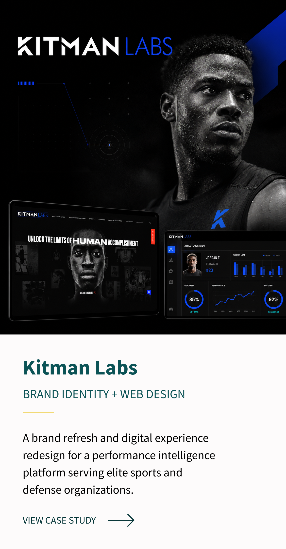
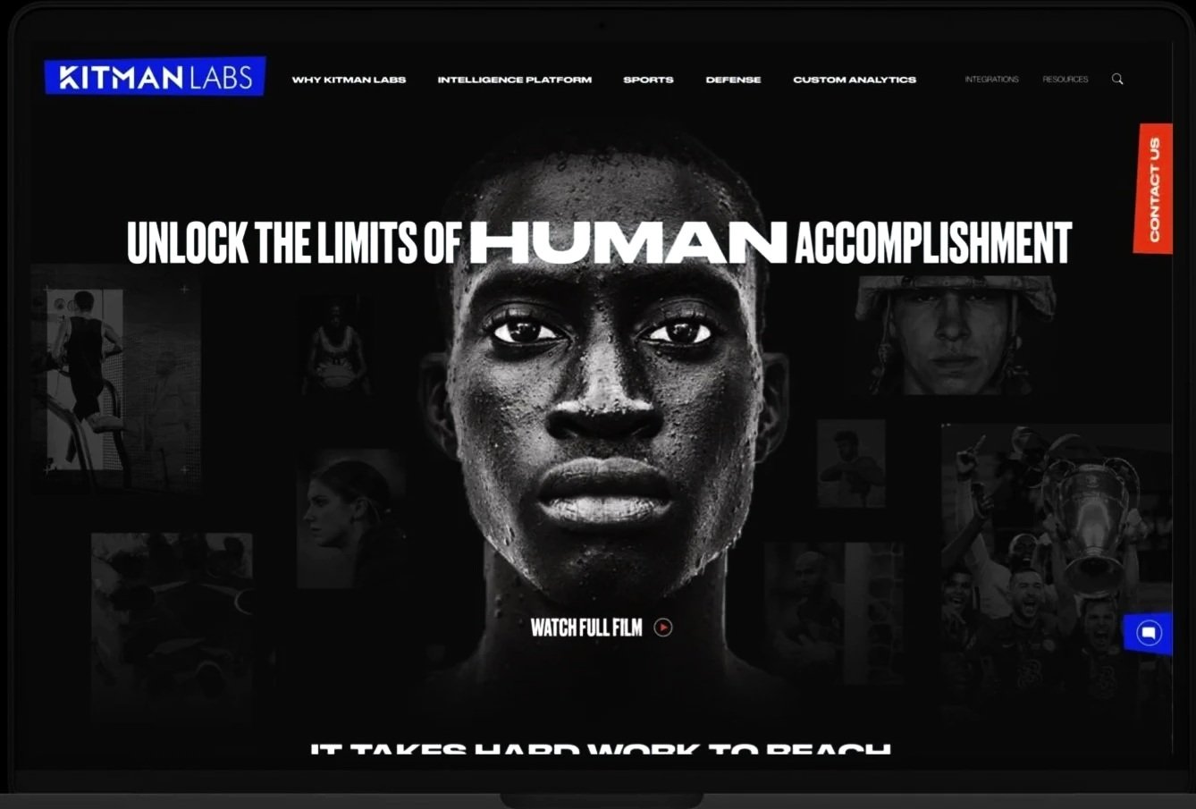
01 / FEATURED CASE STUDY
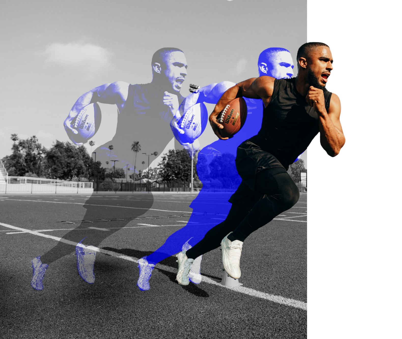
Kitman Labs is a performance intelligence platform built for elite sport and defense. I helped reshape its brand and digital presence into a bolder, more human approach. With bold design and fun navigation this project made complex data feel clear, credible, and connected to real performance.
INDUSTRY
Sports Tech/ SaaS
ROLE
Lead Visual Designer
Brand Identity + UI/UX
SERVICES
Visual & Verbal Identity, Information Architecture, Site Mapping, UI/UX Design, Brand System Refresh, Campaign & Marketing Assets
01 / KITMANLABS / PROJECT CONTEXT
THE CHALLENGE
Kitman Labs had the intelligence and technology to support high-performing organizations, but its digital presence did not fully reflect the depth of the platform or the people behind it.
The challenge was to bring clarity and personality to a complex product by building a brand and website experience that felt confident, human, and built for performance.
Complex platform
A multi-layered product required clearer structure and navigation.
Disconnected identity
The digital experience needed a stronger, more cohesive visual voice.
Lacked human Impact
The brand needed a clearer connection to the athletes and organizations it serves.
01 / KITMANLABS / BRAND DIRECTON
STRATEGY &
BRAND SYSTEM
The new direction was built around a simple idea: performance intelligence is ultimately about people.
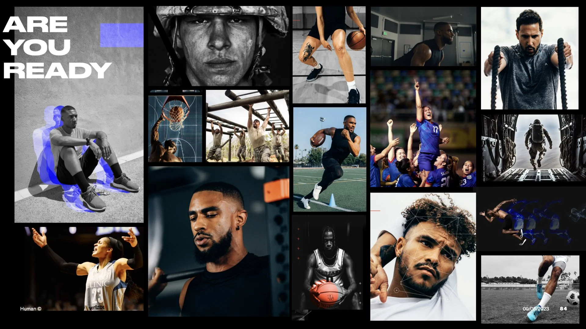
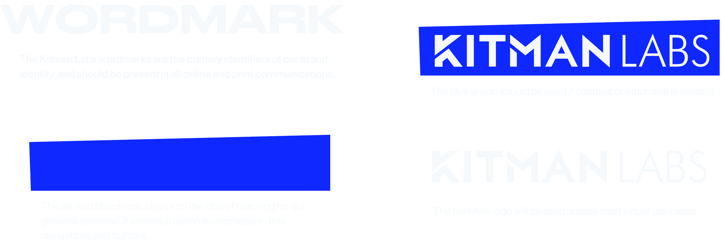
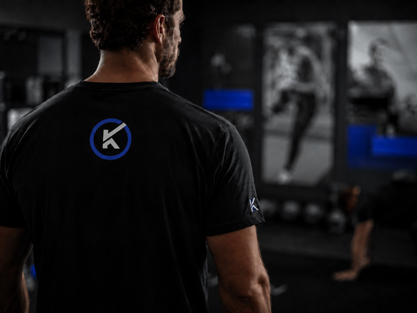
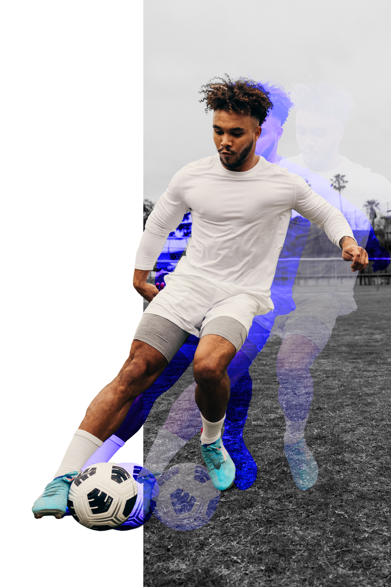
I developed a visual system that balanced technical precision with human energy, using bold typography, high-contrast photography, electric blue accents, and a structured layout language designed to scale across the brand and website.
DESIGN FOCUS
Put human performance at the center of the story
+
Clarify a complex offering through stronger hierarchy
+
Build a more distinct and confident visual identity
+
Create a flexible system for digital and brand touchpoints
+


01 / KITMANLABS / WEB DESIGN
DIGITAL EXPERIENCE
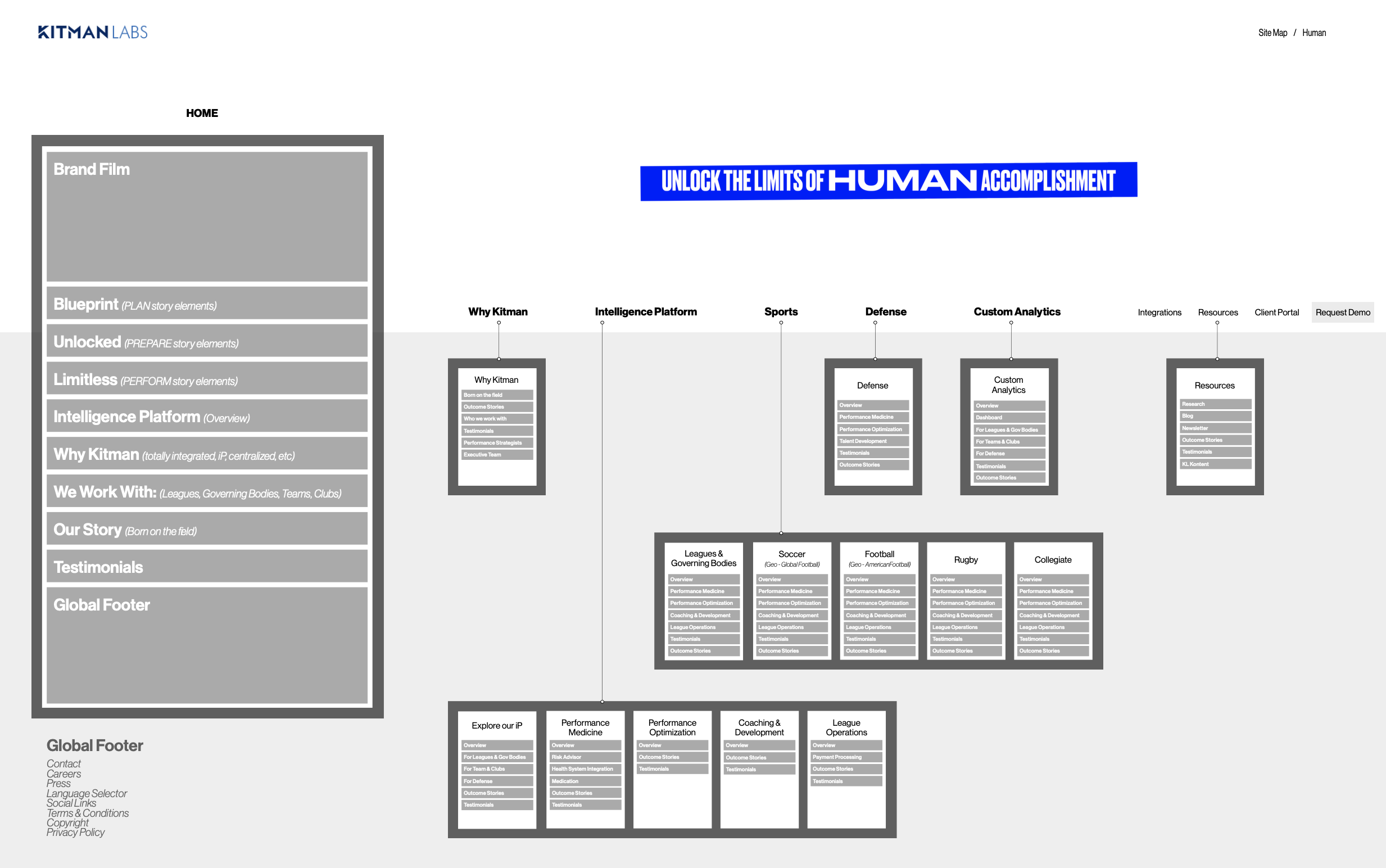
The website redesign translated a dense, multi-layered platform into a bold digital experience.
Through updated information architecture, purposeful page structure, and a stronger UI system, the site helps audiences understand what Kitman Labs does, who it supports, and why its platform matters.
01 / KITMANLABS / ART DIRECTION
VISUAL LANGUAGE
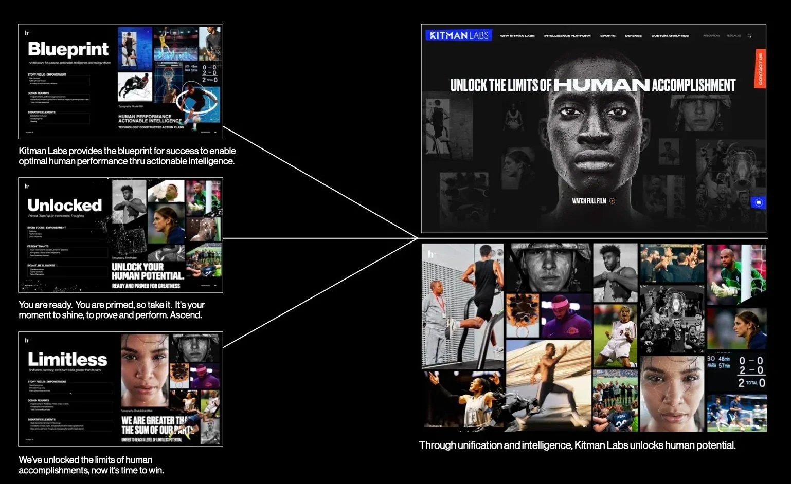
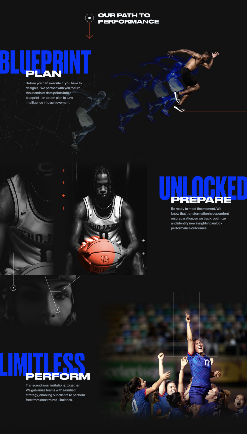
Kitman Labs works with complex data, but the brand story needed to feel immediate and human. The visual language was built around a clear progression: Plan. Prepare. Perform.
This framework gave the platform a more emotional entry point. Rather than leading only with analytics and technology, the brand connects intelligence to the real outcome behind the data: helping people and teams reach their potential.
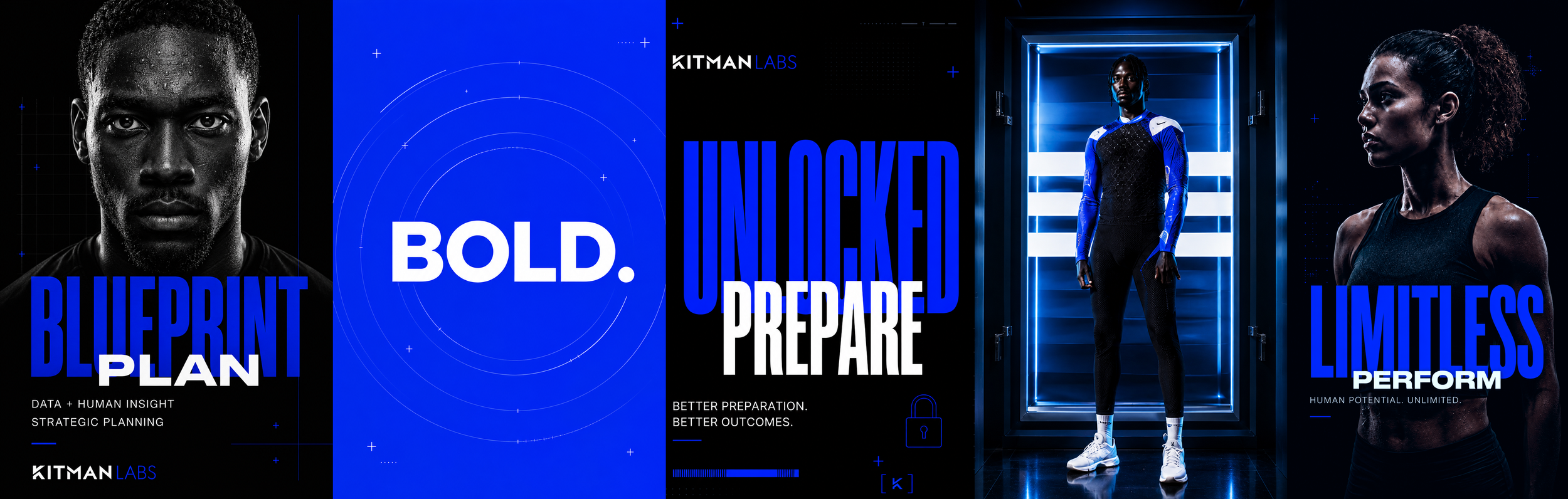
BLUEPRINT/PLAN
Every performance journey starts with a plan. Blueprint positioned Kitman Labs as the system that turns complex data into clear, actionable direction.
UNLOCKED/PREPARE
Insight only matters when it helps people act. Unlocked connected the platform to readiness giving teams the intelligence they need to prepare with purpose and confidence.
LIMITLESS/PERFORM
The final expression brings the story back to the human outcome. Limitless represents performance without barriers: athletes and organizations equipped to reach what is possible.
01 / KITMANLABS / RESULT
OUTCOME
The Kitman Labs redesign brought clarity and confidence to a complex performance intelligence platform. Through a stronger visual identity, athlete led storytelling, and a more structured website experience, the work connected the power of the technology to the people and organizations behind it.
The redesign was recognized for its design and execution in 2023, earning honors from both The One Club for Creativity Denver and Ad Club Colorado.
MERIT WINNER
The One Club for Creativity Denver
2023 Denver Awards
Interactive, Online & Mobile
GOLD BAR WINNER
The Fifty Awards
Ad Club Colorado
2023


+
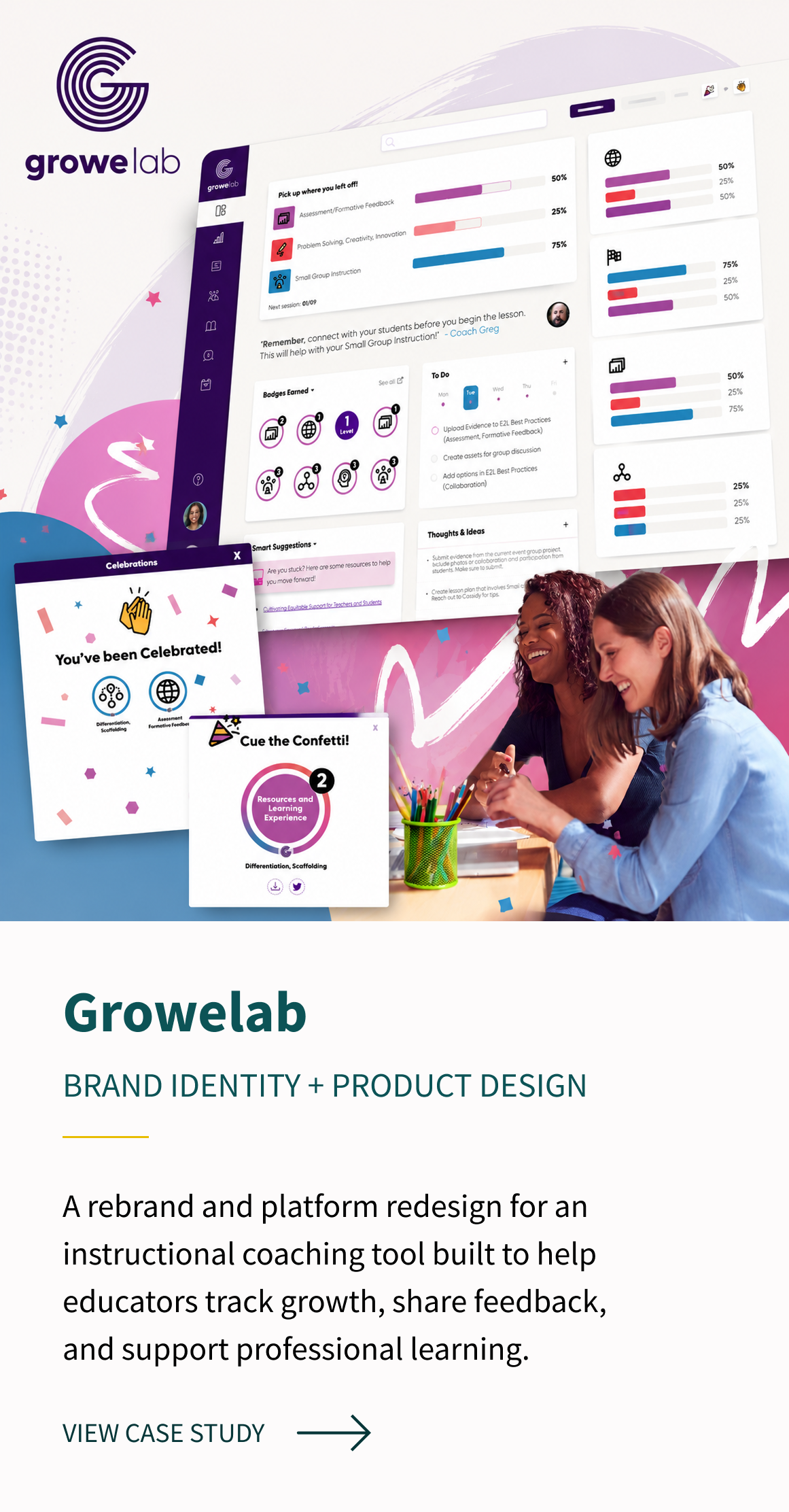
02 / FEATURED CASE STUDY
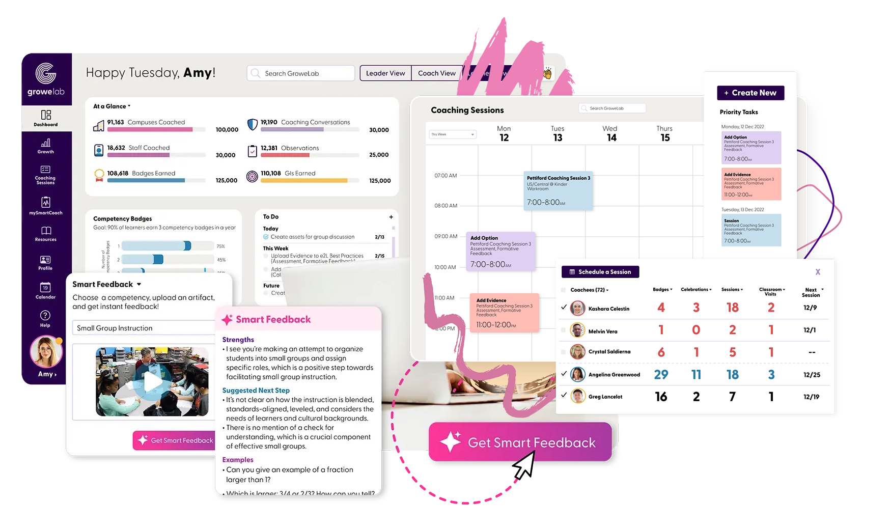
GroweLab is an all-in-one instructional coaching and professional learning platform built for public schools. Working with the engage2learn team, I helped transform an early, barebones system into a complete brand and product experience designed around how educators, coaches, and school leaders actually work.
INDUSTRY
Education Tech/ Professional Learning
SERVICES
Brand Identity, Idea mapping, Persona Development, Information Architecture, UI/UX Design, Product Experience
ROLE
Lead Visual Designer
Brand Identity + UI/UX
02 / GROWELAB / PROJECT CONTEXT
THE CHALLENGE

GroweLab started with a big purpose and a very early product foundation: help schools move beyond scattered spreadsheets, disconnected systems, and professional development that is difficult to track or act on.
The challenge was to help define a platform that could feel useful and intuitive for educators, scalable for school leaders, and encouraging for the people using it every day.
Growing Platform
The platform needed an experience that could support more tools, users, and workflows.
Complex Workflows
Coaches and educators needed clearer paths through observations, feedback, and progress tracking.
Connected Support
The experience needed to help districts and educators feel guided, recognized, and supported.
02 / GROWELAB / BRAND DIRECTION
STRATEGY +
BRAND SYSTEM
Through persona development and collaboration with the engage2learn team, we explored what teachers, instructional coaches, and school leaders needed from a professional learning system: less administrative friction, clearer progress tracking, more useful feedback, and a way to make growth feel visible and meaningful.
That thinking shaped both the product and the identity. I developed a brand and interface system that feels optimistic and encouraging while still supporting the complexity of a professional education platform.
LOGO SYSTEM


WEB FLOW
COLOR PALETTE

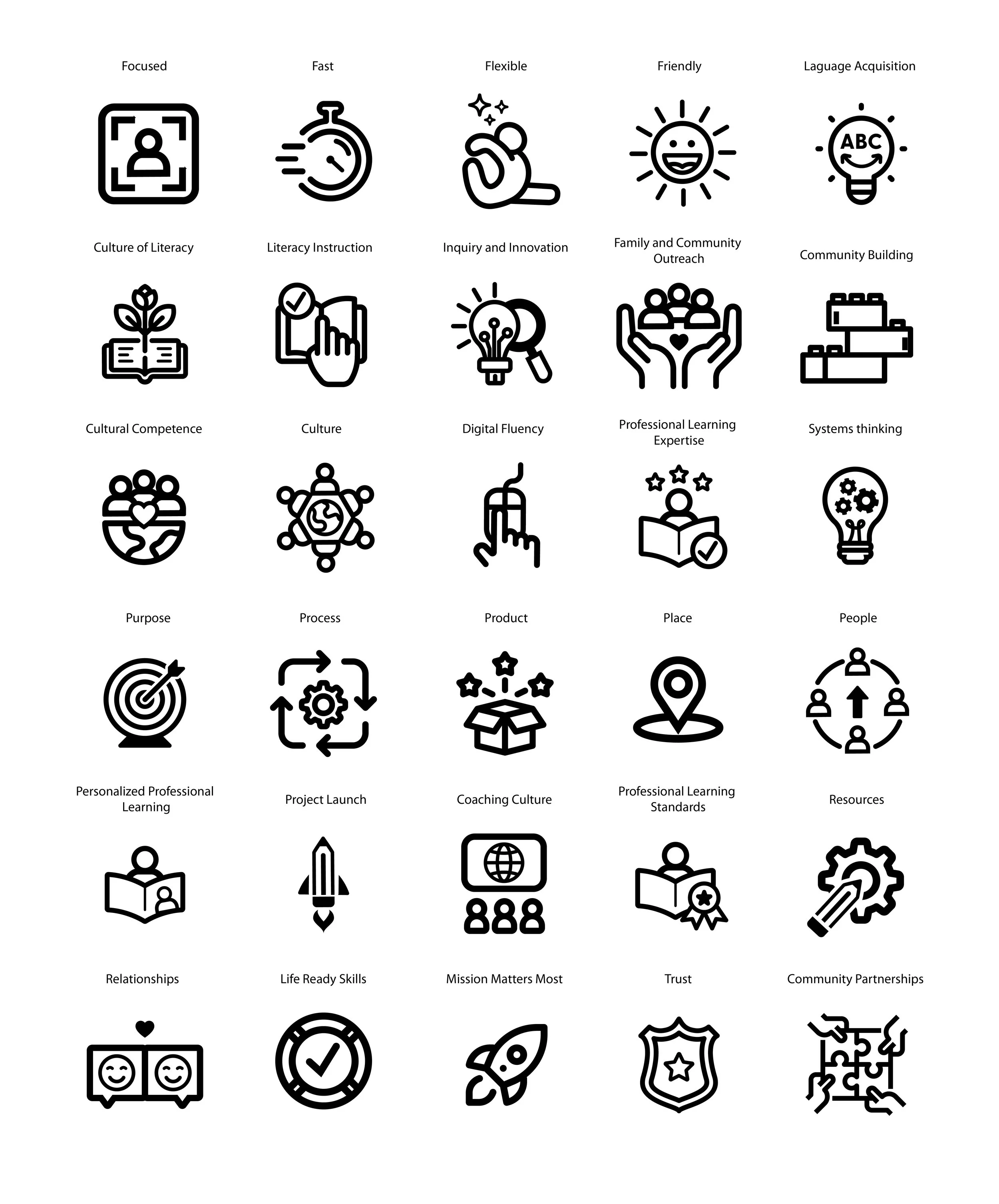
ICONOGRAPHY
TYPOGRAPHY
02 / GROWELAB / PRODUCT DESIGN
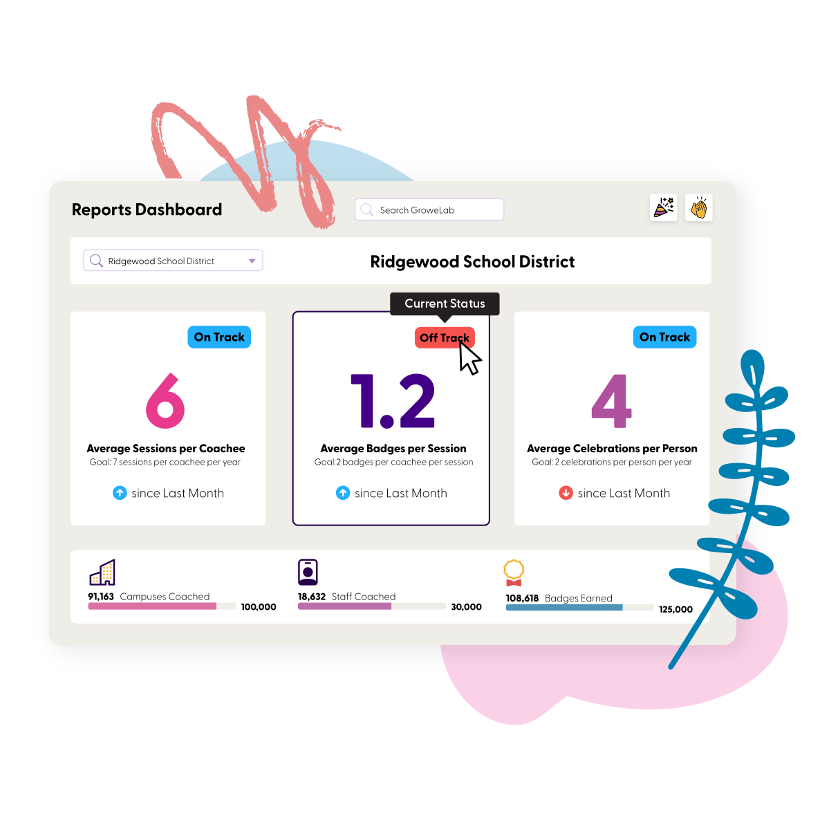
User experience
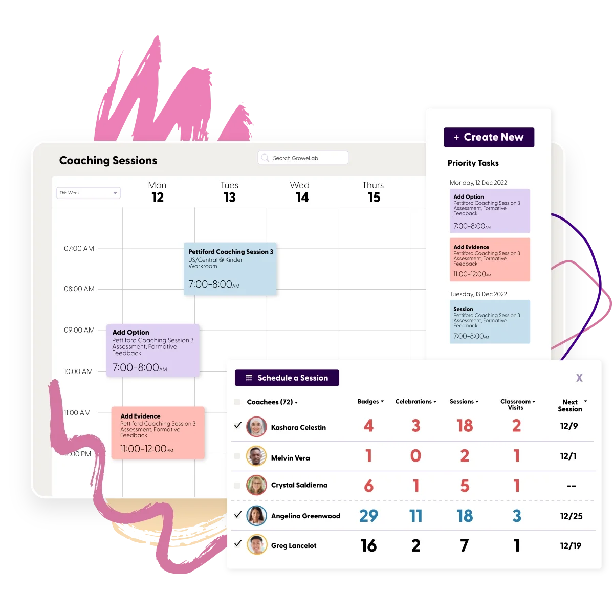
I designed the experience around the ways users needed to move through the platform: coaches scheduling sessions and providing feedback, teachers tracking competencies and collecting evidence, and school leaders understanding growth across programs and teams.
The redesigned interface organizes dense workflows into clear moments. Making it easier to manage calendars, complete observations, review progress, celebrate achievement, and turn professional learning data into meaningful action.
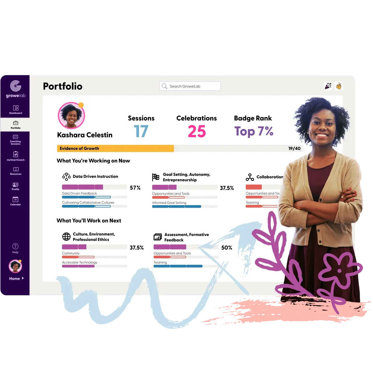
Coach Dashboard
Tools for scheduling sessions, organizing priorities, sharing feedback, and supporting ongoing coaching relationships.
Pro Learning Management
A centralized experience for organizing educator development, competencies, goals, and learning progress.
Progress & Competencies
A structured system that allows educators to demonstrate growth through real classroom practice and submitted evidence.
Plan Tracking
A way for districts and schools to track initiatives and professional learning goals in one connected platform.
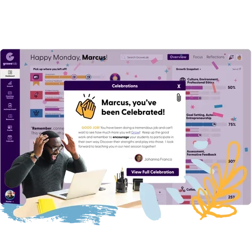
Smart Feedback
Guided feedback experiences designed to help educators receive actionable direction and continue growing.
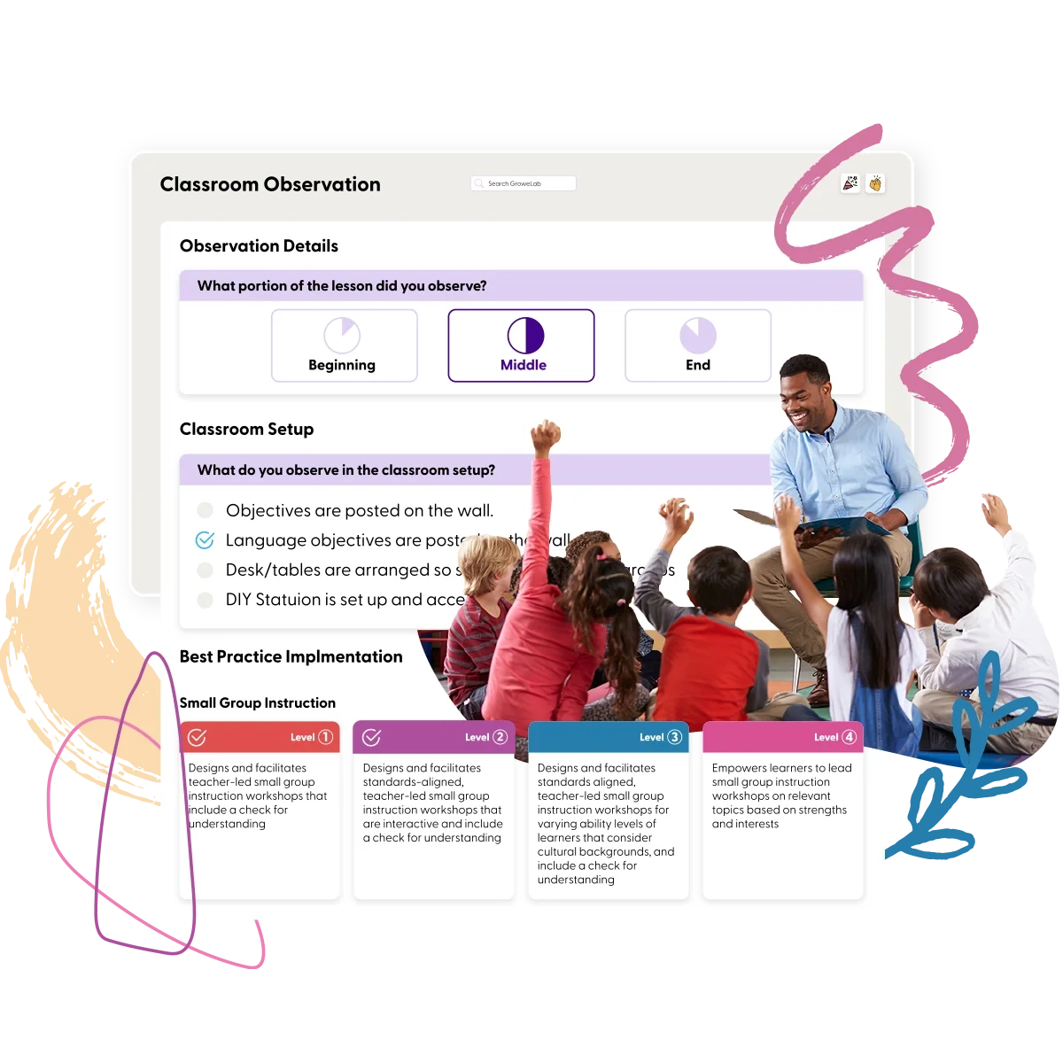
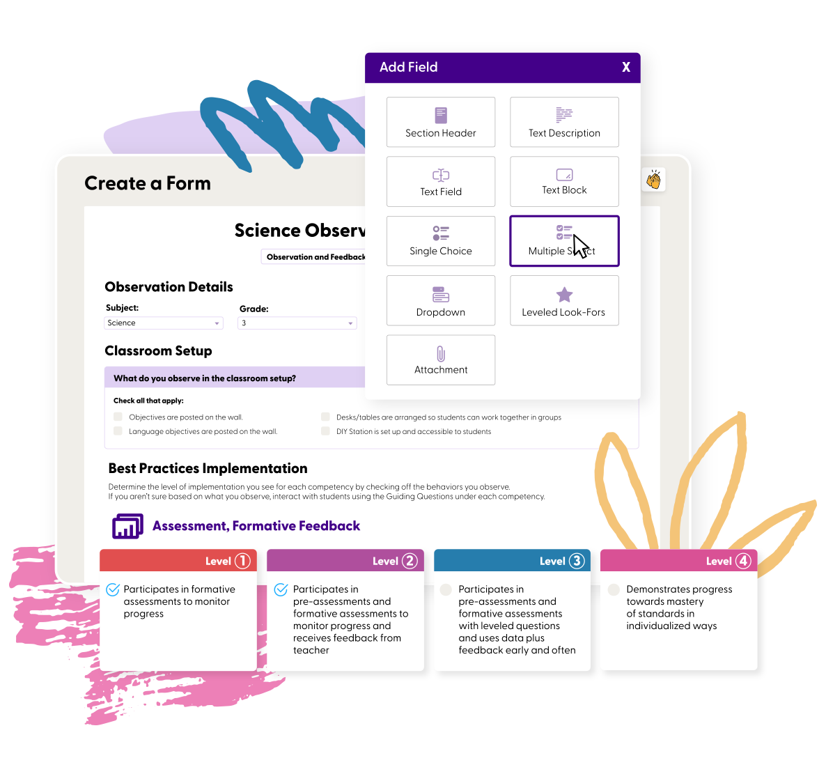
Classroom Observations
Customizable observation workflows that help coaches document practice and connect feedback to school priorities.

02 / GROWELAB / ART DIRECTION
VISUAL LANGUAGE
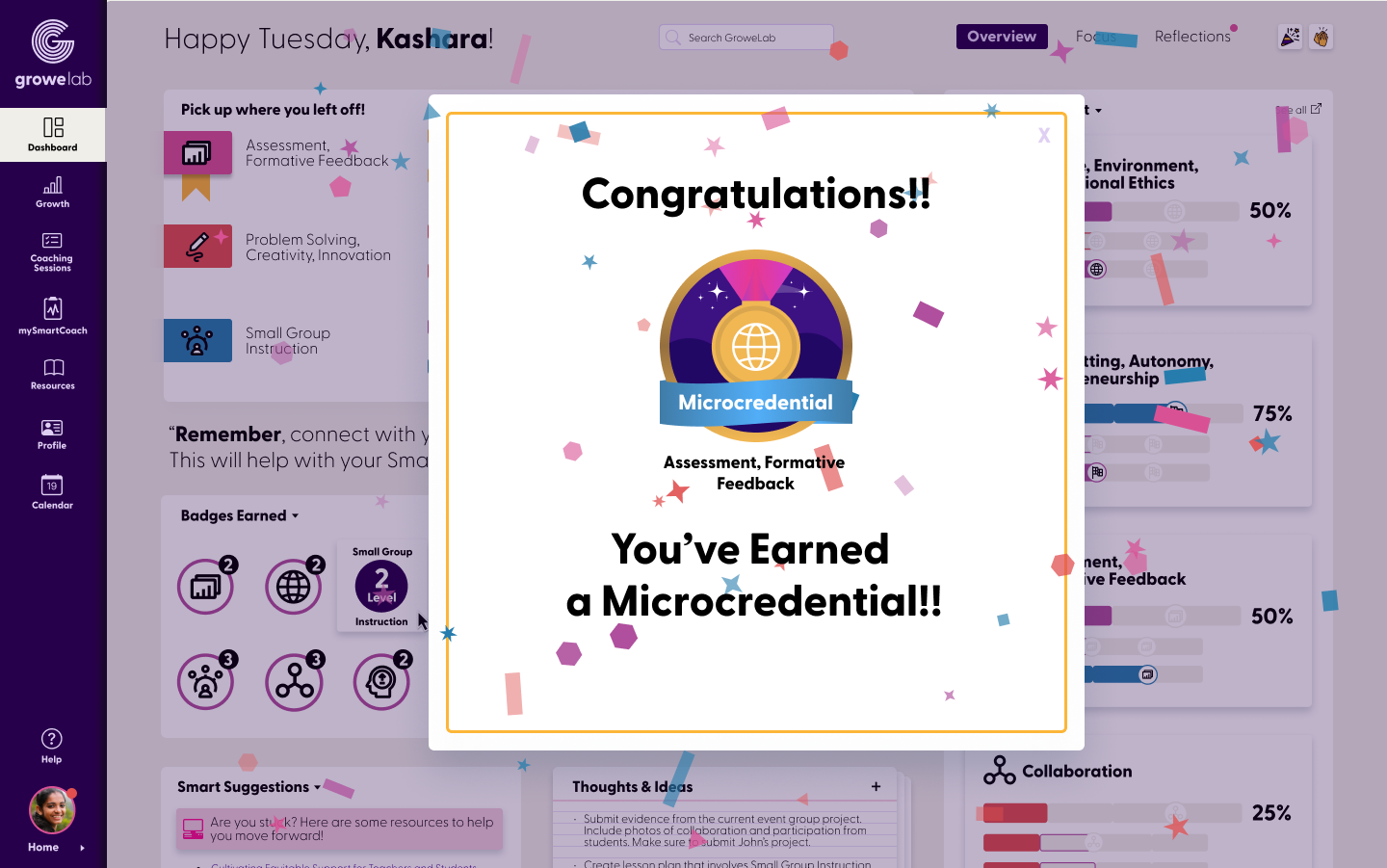
GroweLab needed to feel different from the cold, administrative systems educators are often expected to use.
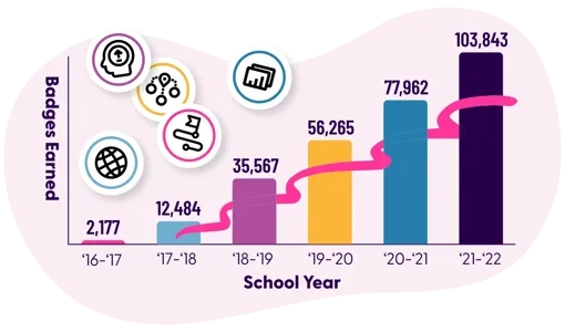
The visual language uses soft color, rounded UI components, hand-drawn details, and celebration moments that bring warmth and personality to the platform.
Badges, milestones, and progress indicators help reinforce the purpose of the experience: supporting educators through meaningful growth and recognizing their progress along the way.
Supportive
Guidance and feedback designed to help educators feel encouraged at every step.
Complex Workflows
Shared tools and conversations that keep coaching connected and actionable.

Connected Support
Milestones and recognition moments that make professional growth visible.

02 / GROWELAB / RESULT
PROJECT OUTCOME
Growelab was an opportunity to help improve how public schools support teachers and the students they serve.
Working closely with educators, I helped build a brand and platform experience that makes coaching, feedback, professional learning, and progress tracking easier to use and more meaningful. The result is a stronger tool for helping teachers grow, giving school leaders clearer insight, and supporting better outcomes across their districts.

Unified Experience
One cohesive brand and product experience across the platform.
Clearer Workflows
A more intuitive system for coaching, feedback, and progress tracking.

Ready to Grow
A stronger foundation built to scale with educators, schools, and future needs.
A stronger tool for helping teachers grow, and supporting better outcomes across districts.


+
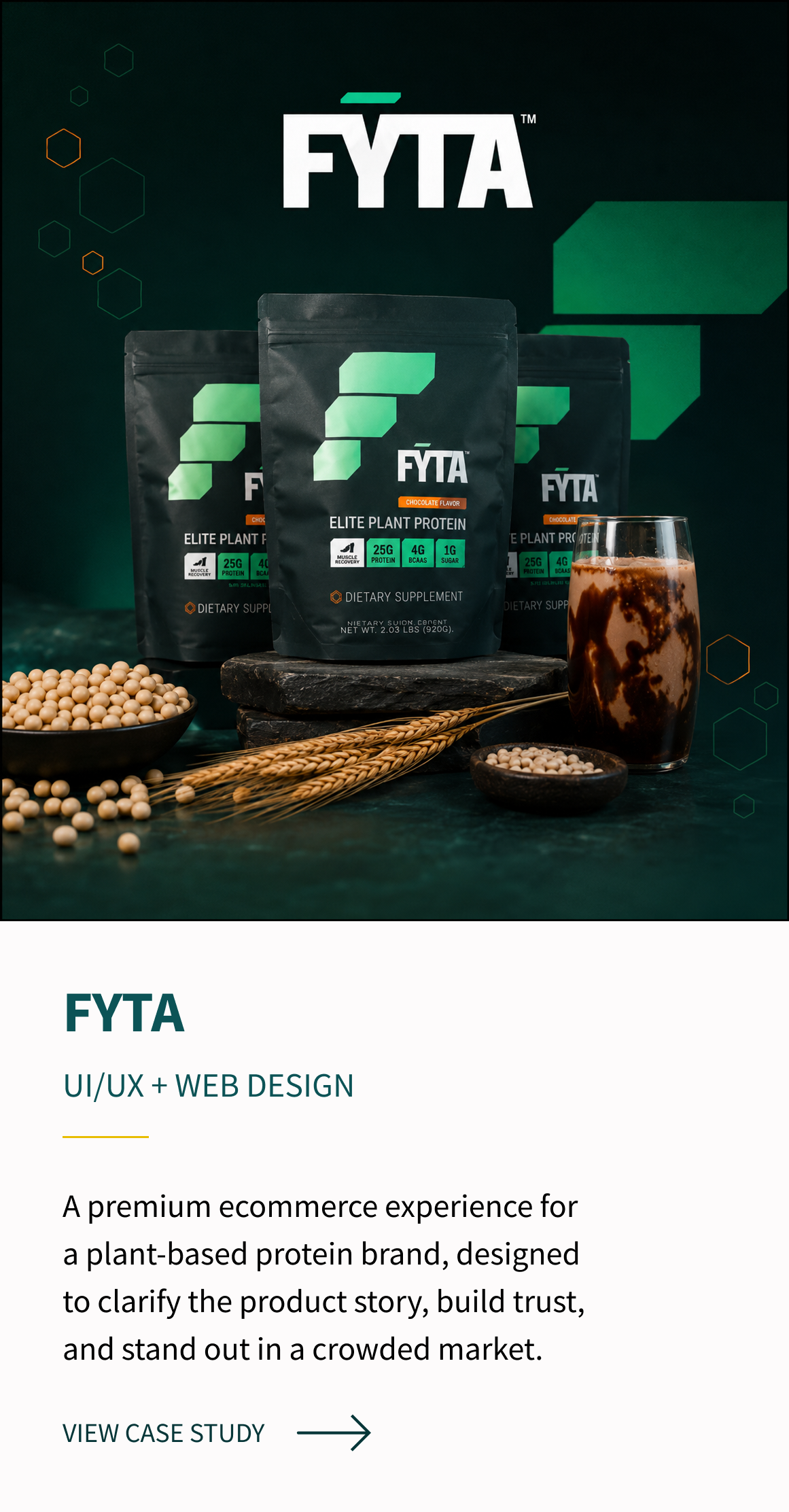
03 / FEATURED CASE STUDY

A premium ecommerce website direction for a plant-based protein brand, designed to clarify the product story, build trust, and stand out in a competitive wellness market.

INDUSTRY
Health + Wellness / Ecommerce
SERVICES
Web Design, Asset Creation, Design Direction, Photography Direction, Site Mapping, Information Architecture
ROLE
Lead Visual Designer
UI Designer
EXPLORE FYTA BELOW

03 / FYTA / CONTEXT
THE CHALLENGE

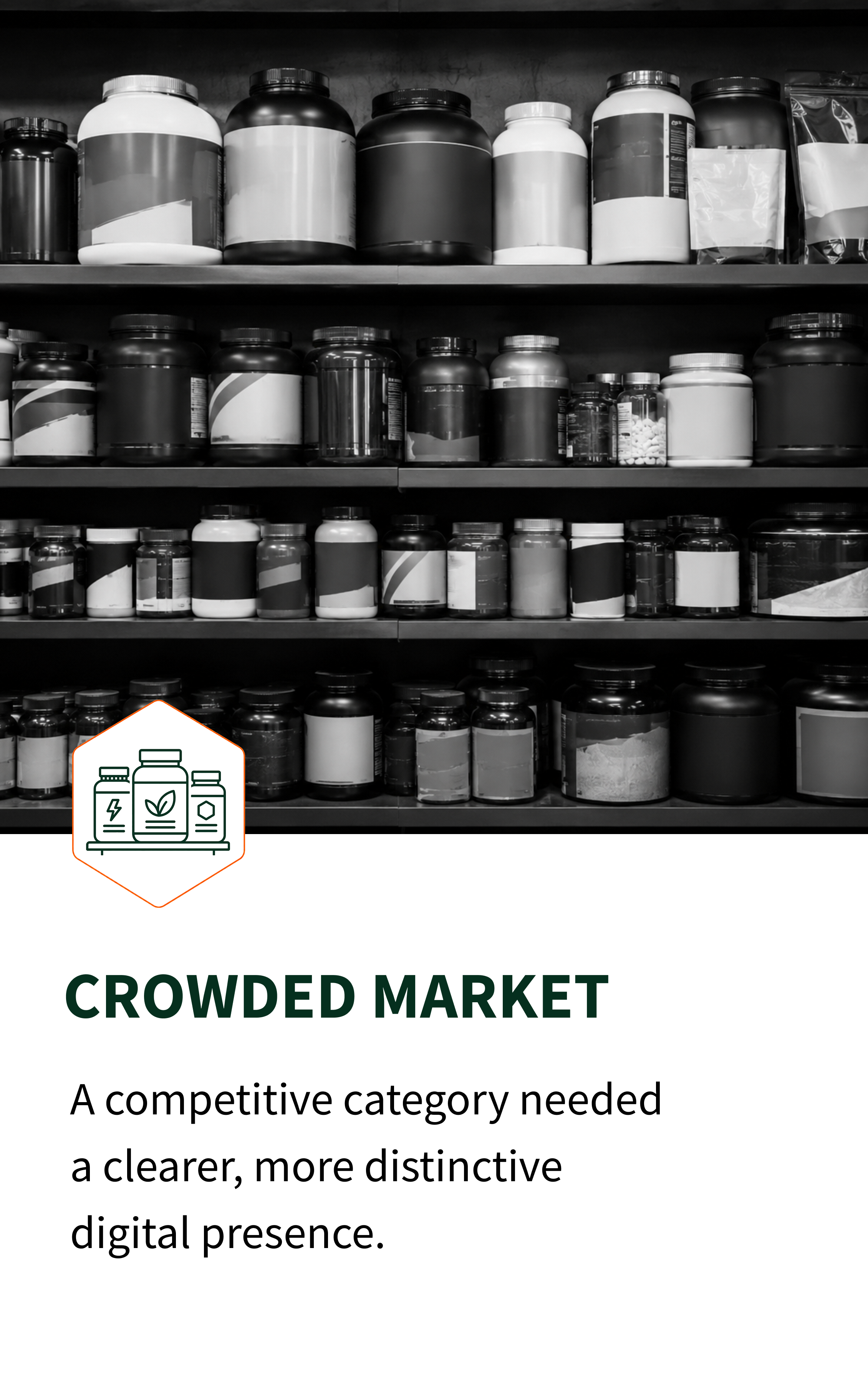
FYTA was entering a crowded plant-based protein market, where many brands were already competing on similar messages around performance, nutrition, and clean ingredients.
The opportunity was to create a digital experience that built trust quickly, clearly communicated what made the product different, and positioned FYTA as a premium choice for active consumers.

03 / FYTA / UI
STRATEGY +
WEB DESIGN

The design direction focused on giving FYTA a cleaner, more premium presence while keeping performance at the center of the brand.
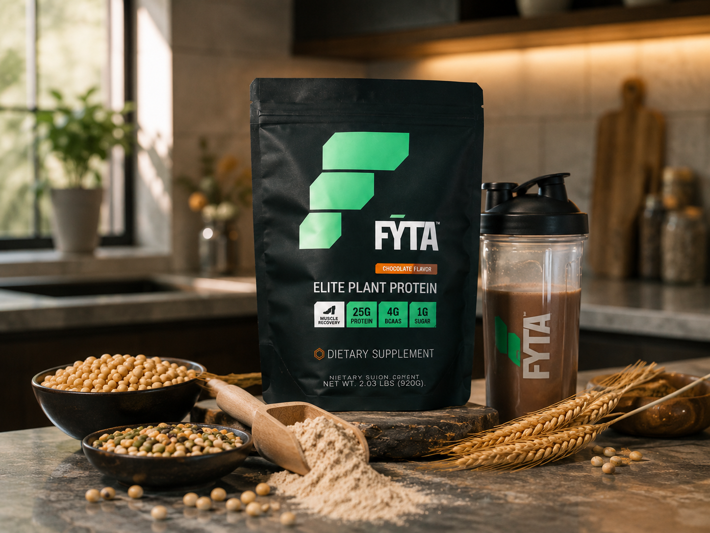
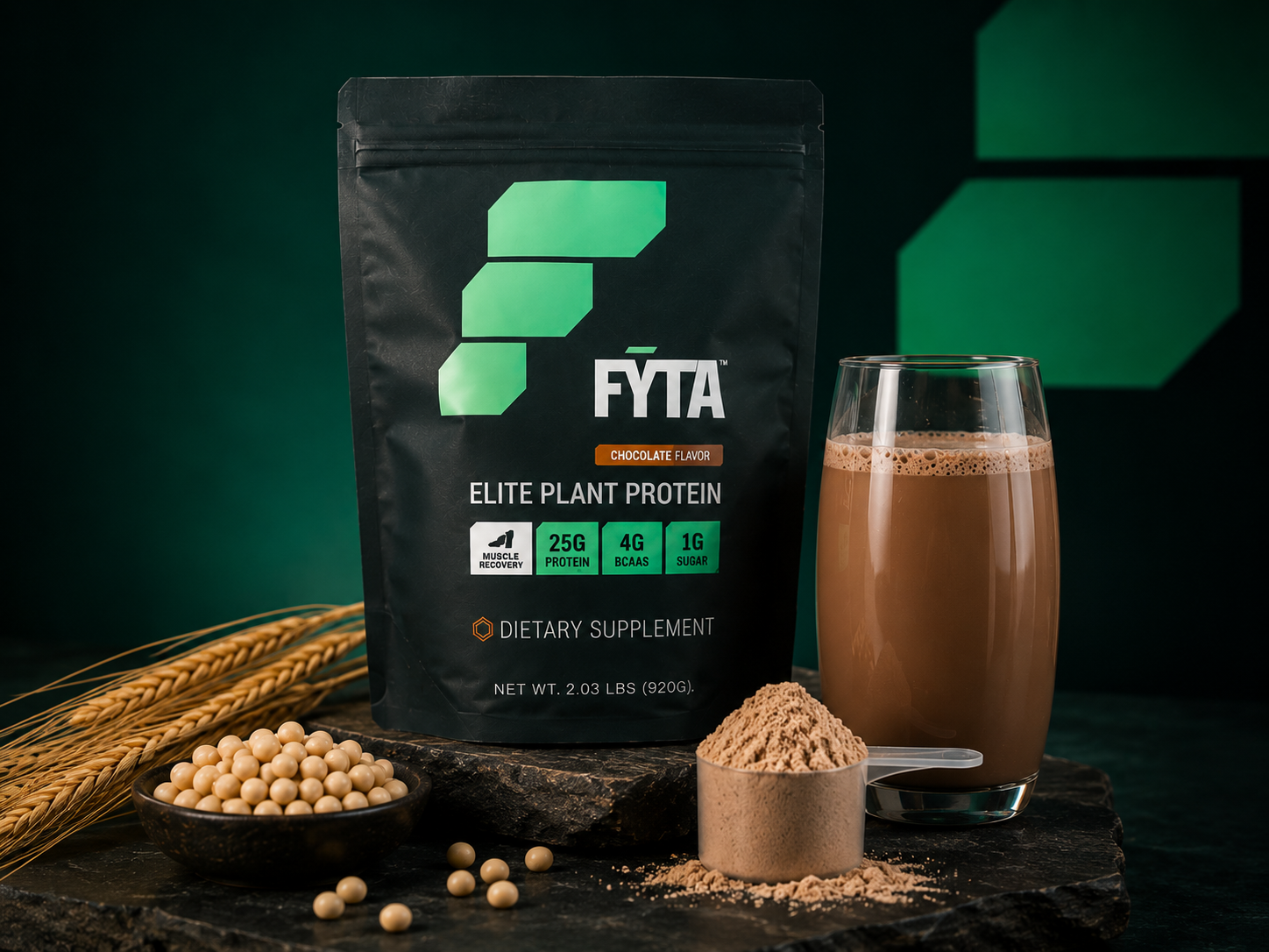
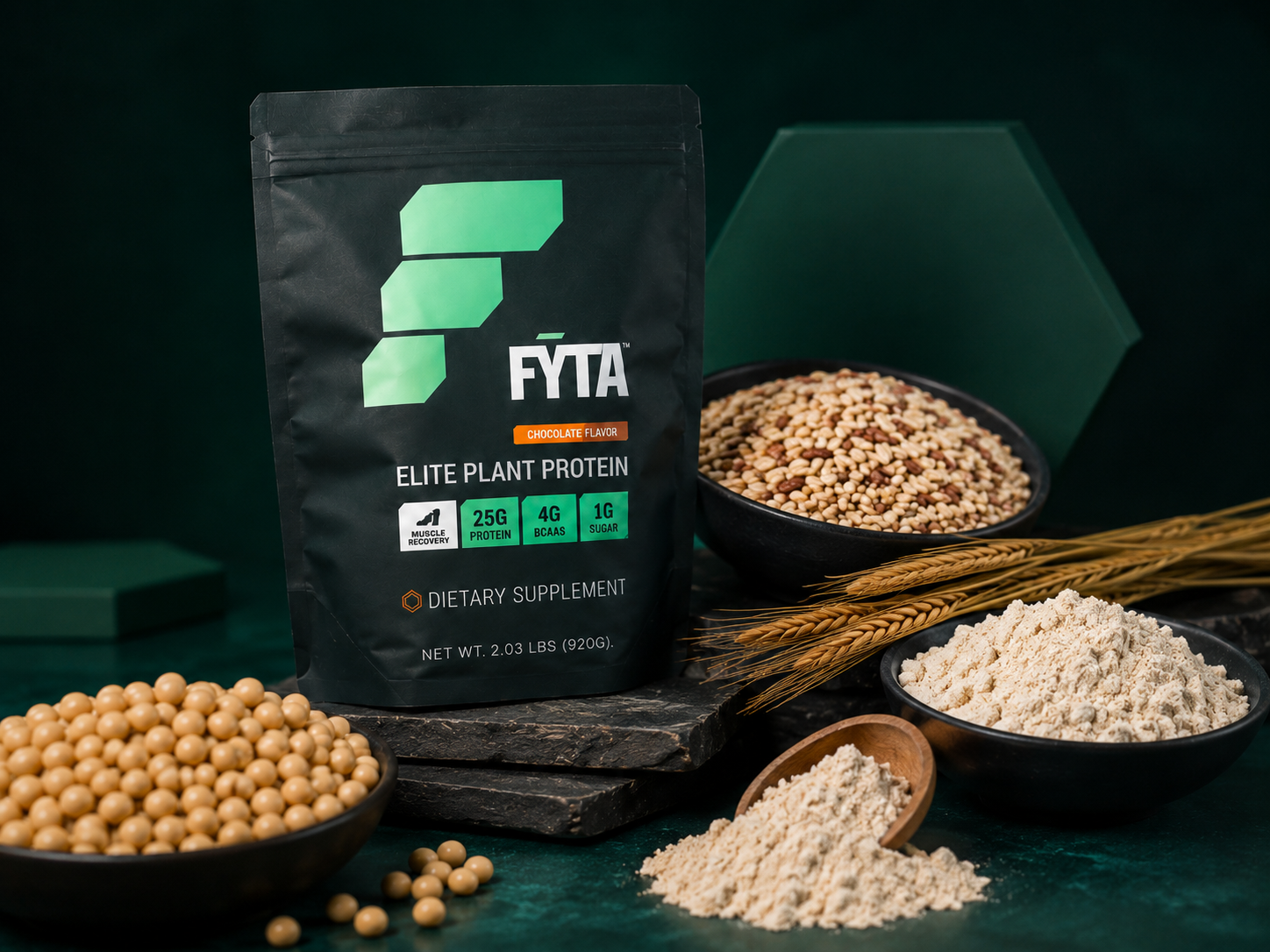
I refined the visual system around deep green, warm neutrals, confident product photography, and structured hexagon details inspired by ingredients and formulation. The goal was to balance athletic energy with product credibility, creating an ecommerce experience that felt elevated, clear, and trustworthy.
COLOR PALETTE

PRODUCT PHOTOGRAPHY

TYPOGRAPHY
ICONOGRAPHY


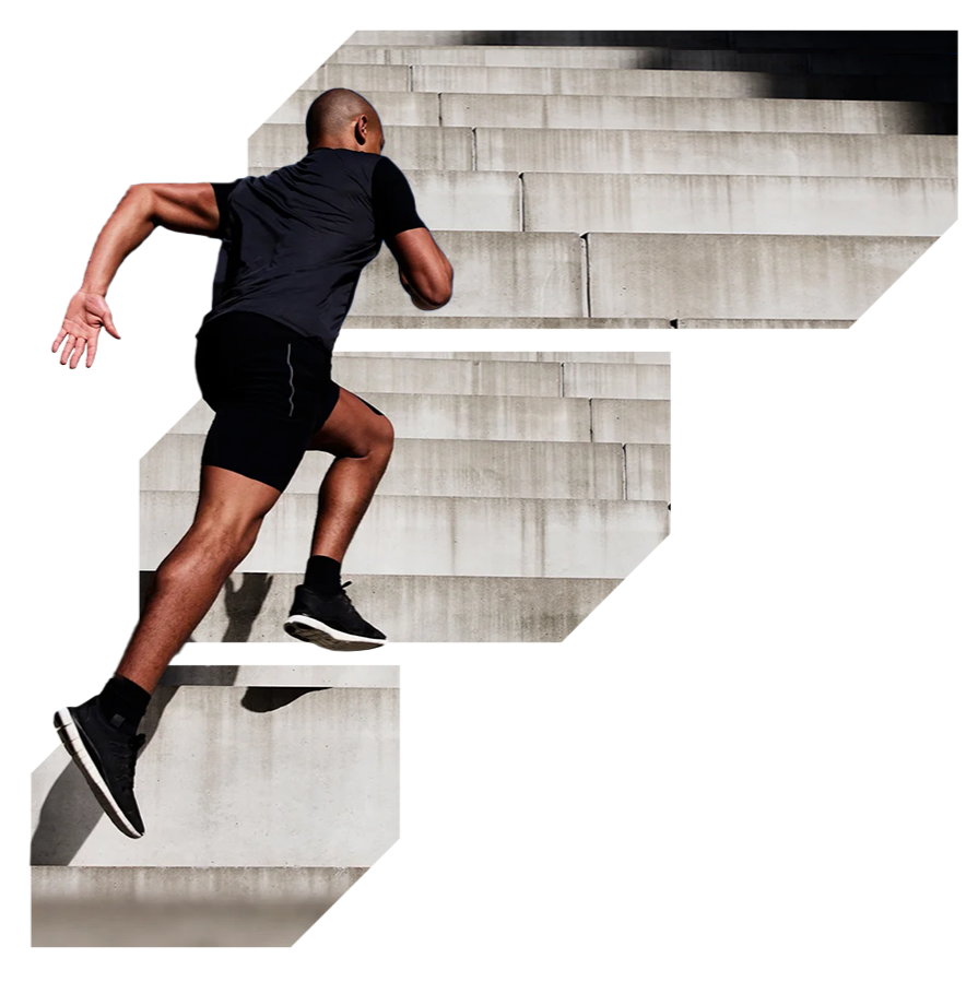
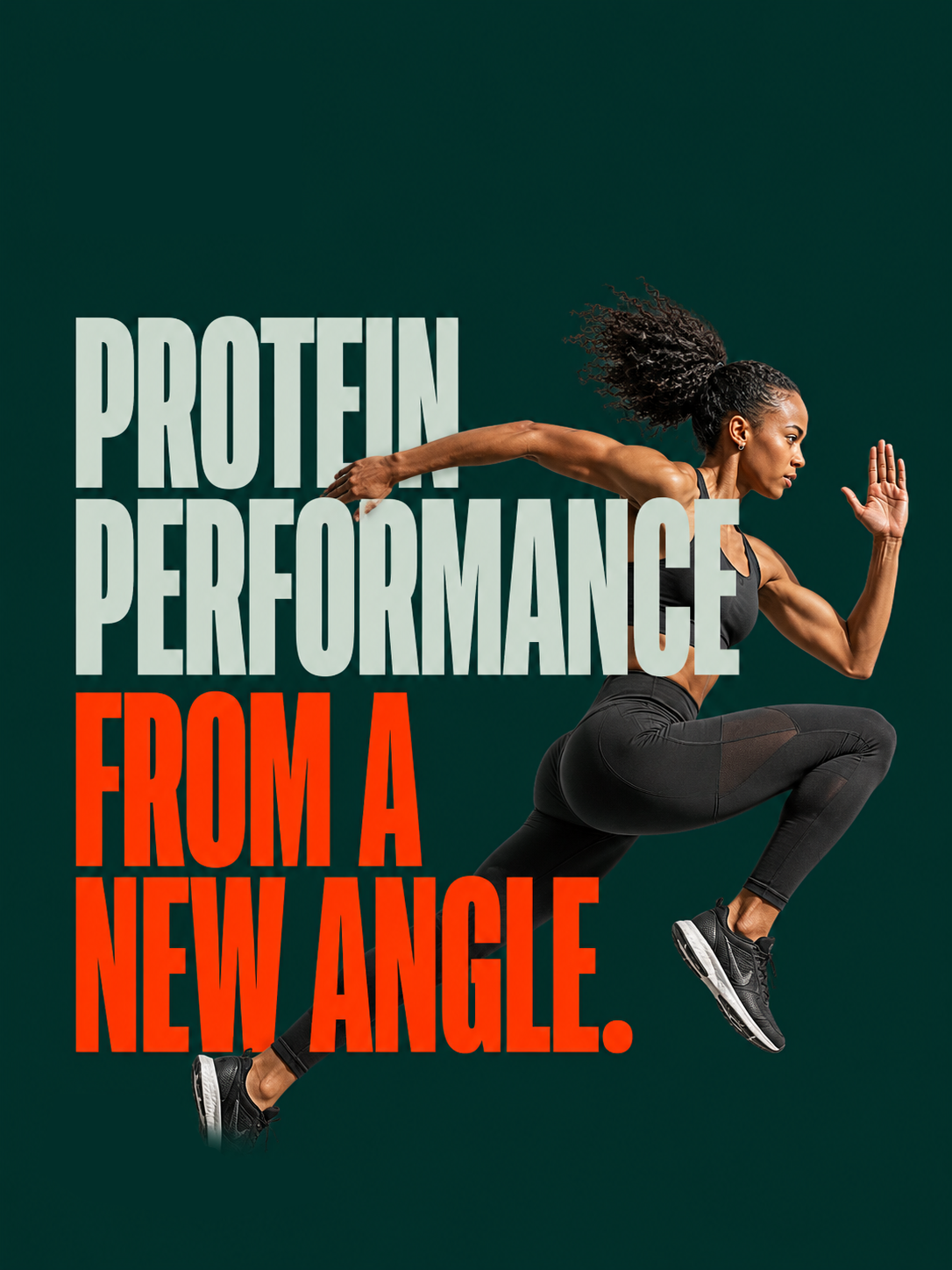
ATHLETE IMAGERY

UI COMPONENTS
03 / FYTA / DIGITAL DESIGN
WEBSITE
EXPERIENCE
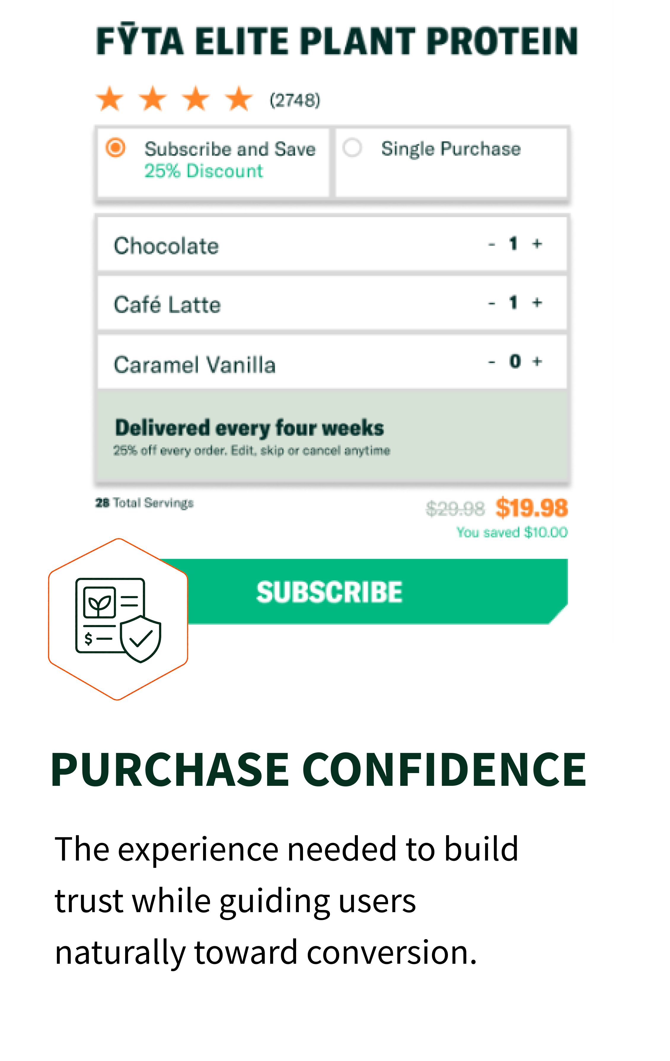
I designed the website around the questions customers need answered before making a purchase: What is the product? What makes it different? What is in it? And how does it support performance?
The experience brings those answers forward through strong product imagery, clear nutrition messaging, ingredient storytelling, and focused conversion moments.

PRODUCT-LED HERO
A bold introduction that brings performance benefits, product imagery, and purchase options together immediately.
CLEAR INGREDIENTS
A clear visual story that explains the formulation and helps customers understand what makes the product different.
PERFORMANCE BASED
Easy-to-scan messaging connects nutrition, taste, convenience, and performance benefits to everyday use.
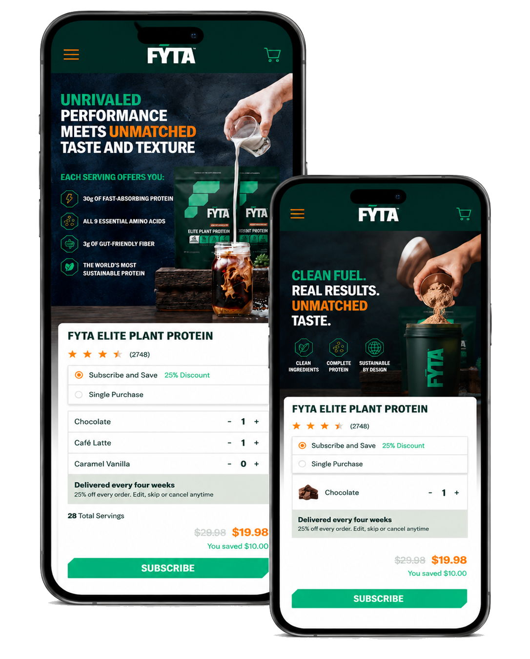
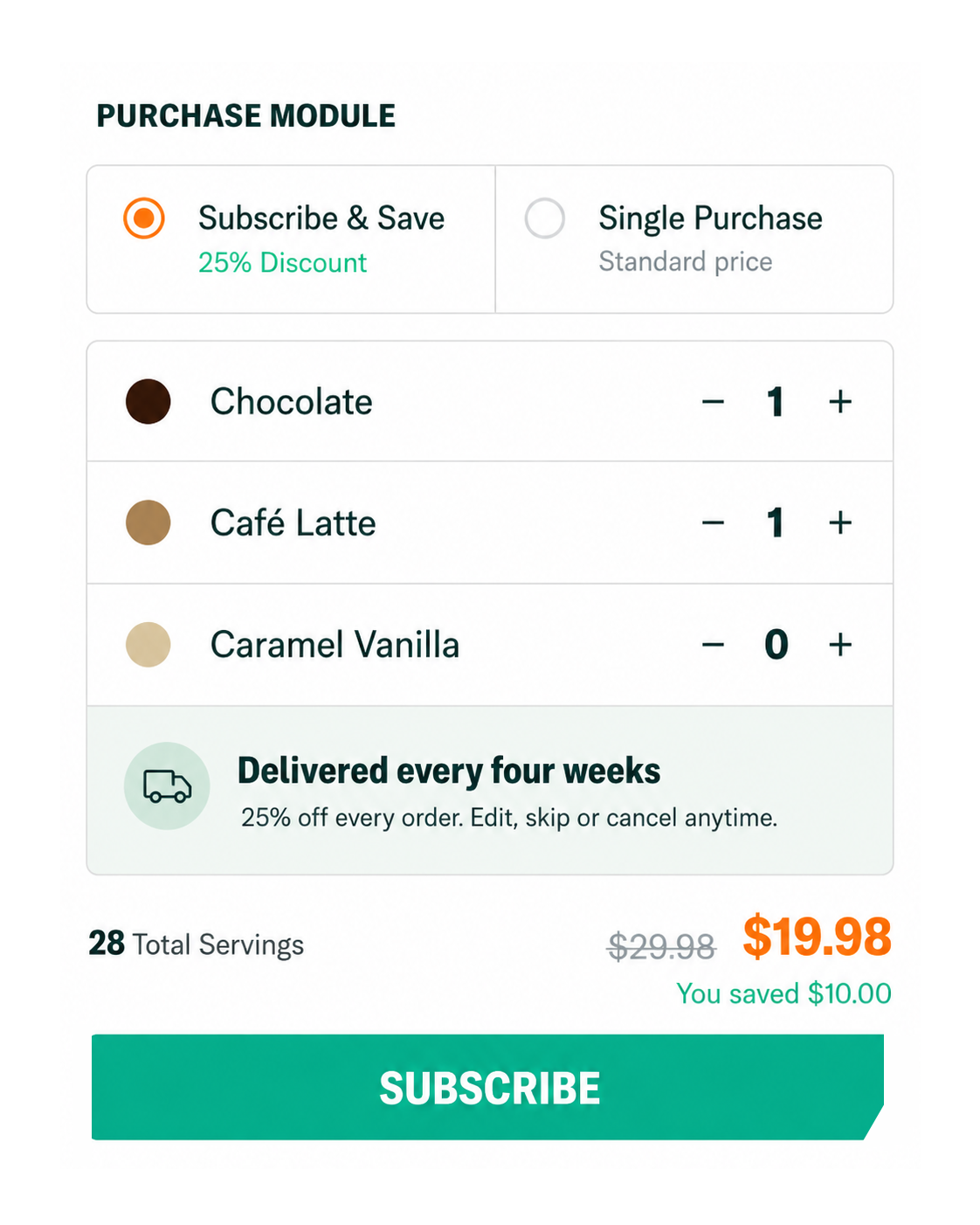
PURCHASE UX
A streamlined digital layout designed to keep the product from interest to purchase.
03 / FYTA / ART DIRECTION
VISUAL
LANGUAGE
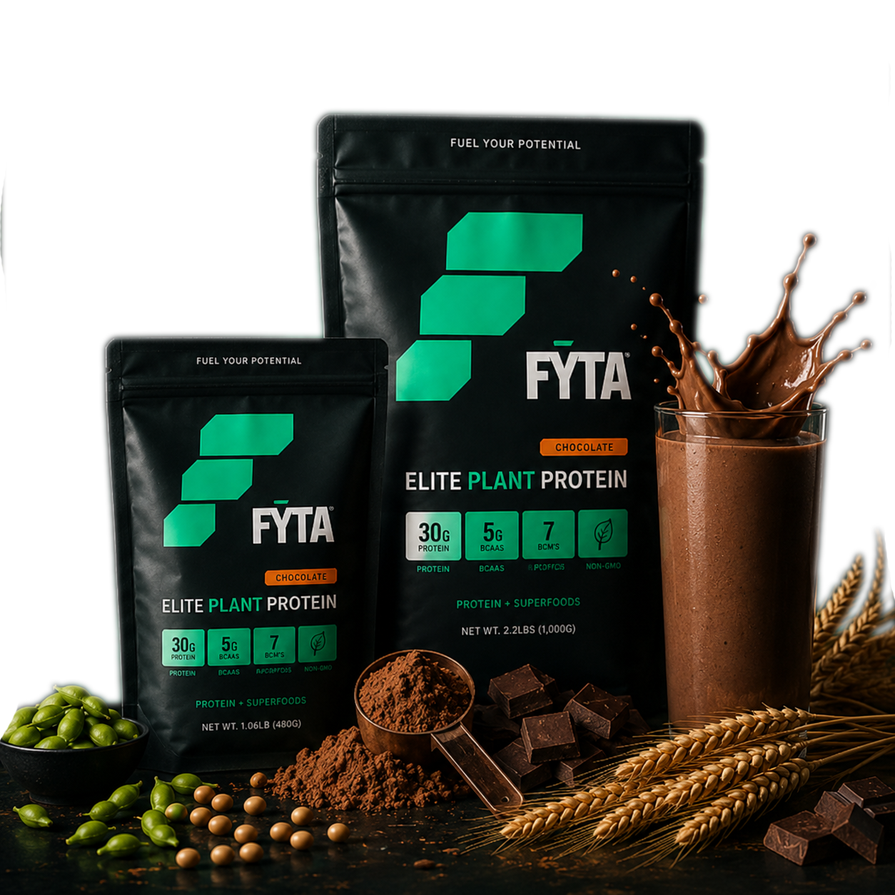
FYTA’s visual language combines clean nutrition with athletic performance. Deep green creates a premium foundation, while warm cream, orange accents, hexagon details, and movement-focused photography give the brand energy and structure.
The resulting direction feels confident and product-forward, giving FYTA a stronger presence for an audience looking for performance without compromise.

03 / FYTA / PROPOSED UI
DESIGN
OUTCOME

The FYTA website concept was designed to give the brand a clearer, more premium presence in a highly competitive category.
By combining product education, athletic storytelling, and a focused ecommerce journey, I created a digital direction that communicates FYTA’s value with confidence, builds trust in the product, and creates a stronger path from discovery to purchase.
A stronger digital story built around performance, ingredients, and trust.
CLEARER POSITIONING

PRODUCT EXPERIENCE
A polished ecommerce direction that gives the product an elite feel.
A journey designed to encourage interest and leads to purchase.
CONVERSION-READY
PREMIUM + CLEAR
A color system and clean layout elevate the shopping experience.
+
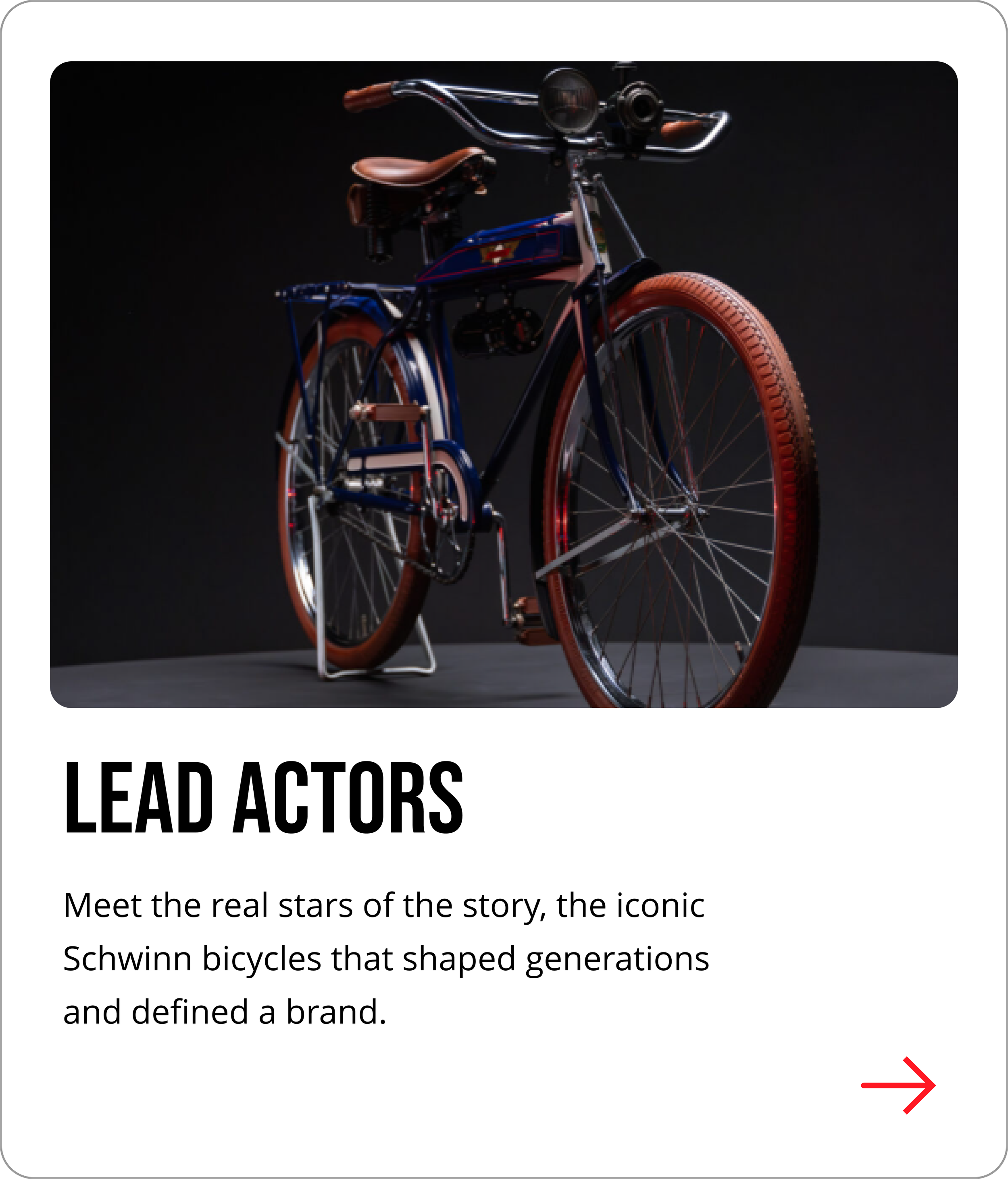
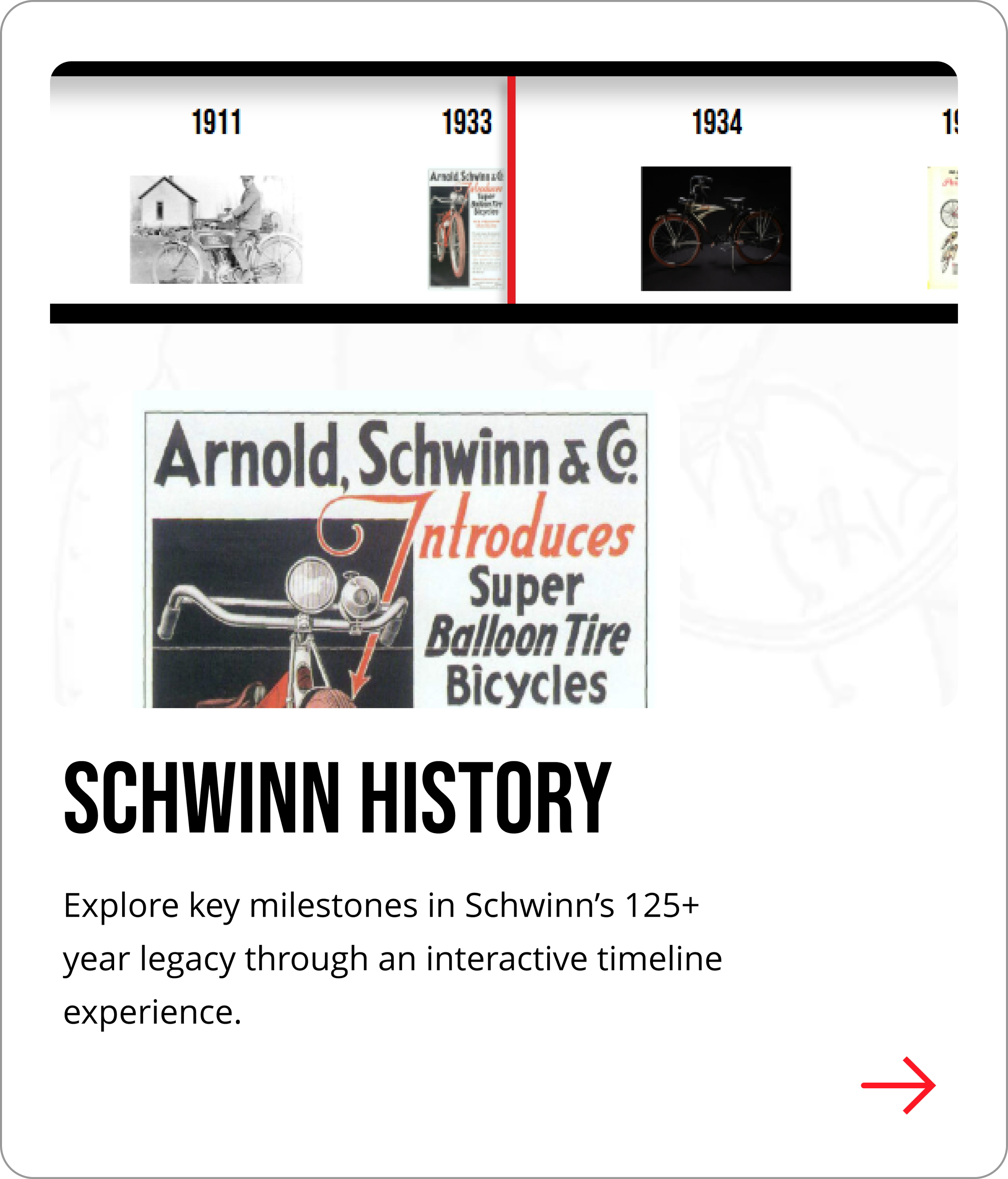
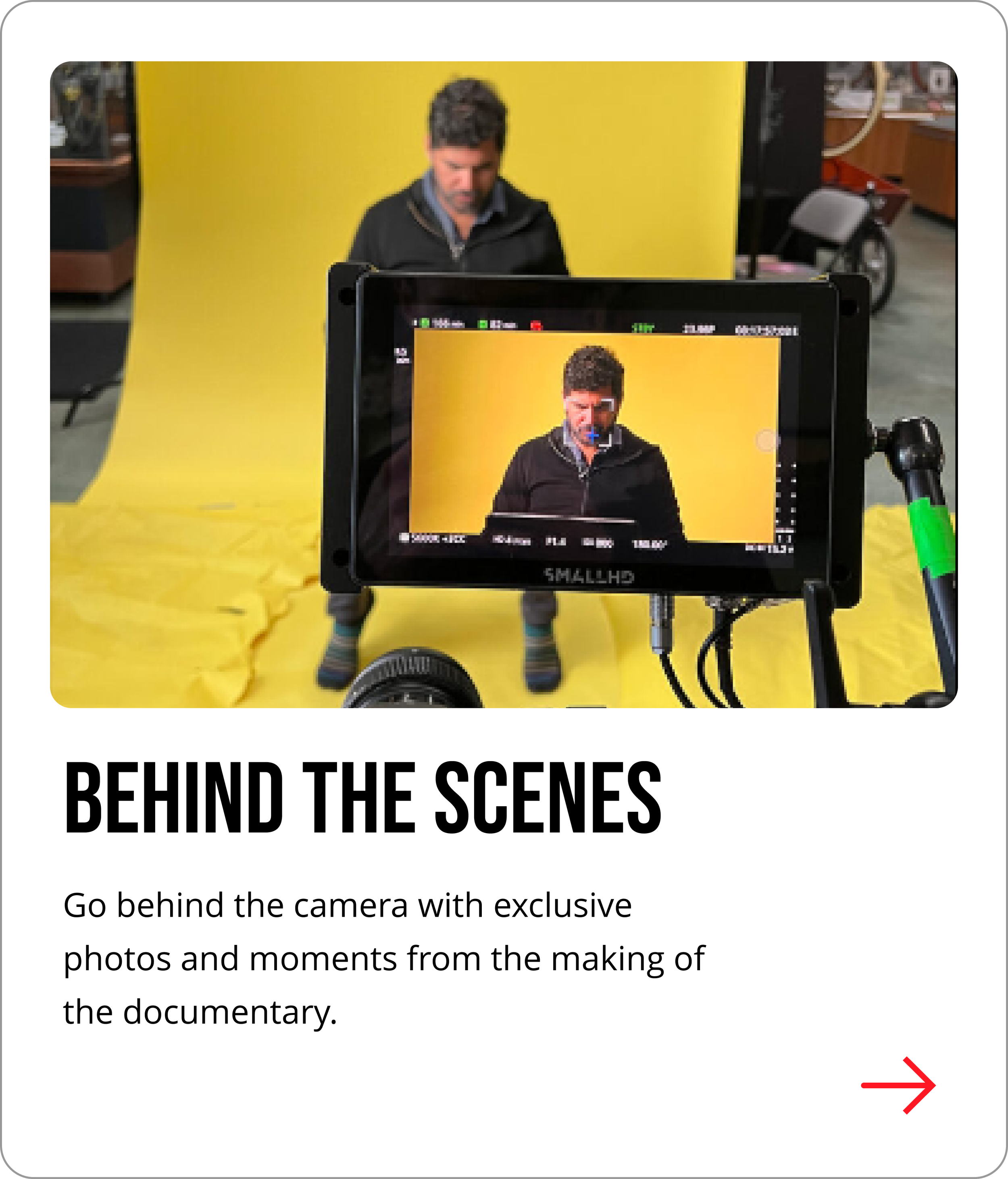
04 / EXTRA CASE STUDY

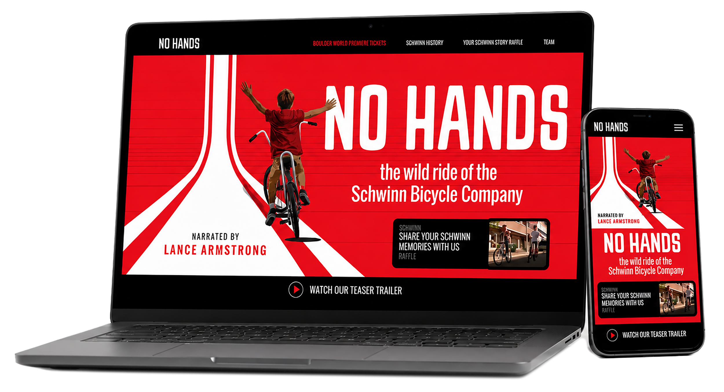
A cinematic, content-rich website designed to build anticipation for the upcoming documentary about the Schwinn Bicycle Company, its iconic legacy, and the American family behind it.
Documentary / Entertainment
INDUSTRY
UI/UX + Web Design
ROLE
WEBSITE
PROJECT CONTEXT
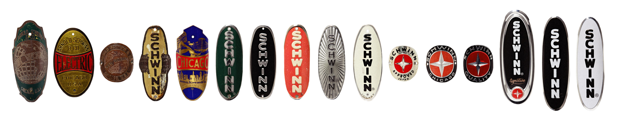
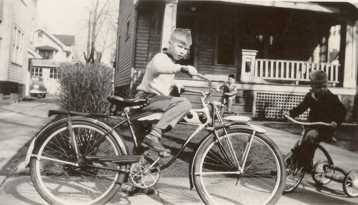
The Schwinn story is filled with nostalgia, innovation, family legacy, and mystery. The goal was to create a digital home that could honor that history while building excitement for the upcoming documentary.
THE CHALLENGE
Balance vintage Americana with a modern documentary experience. The site needed to organize a layered story spanning Schwinn history, the bikes, the people, production content, and fan memories into one clear and engaging experience.
Everything that these bicycles represent has to do with americana.
“
Leon Dixon
Design direction
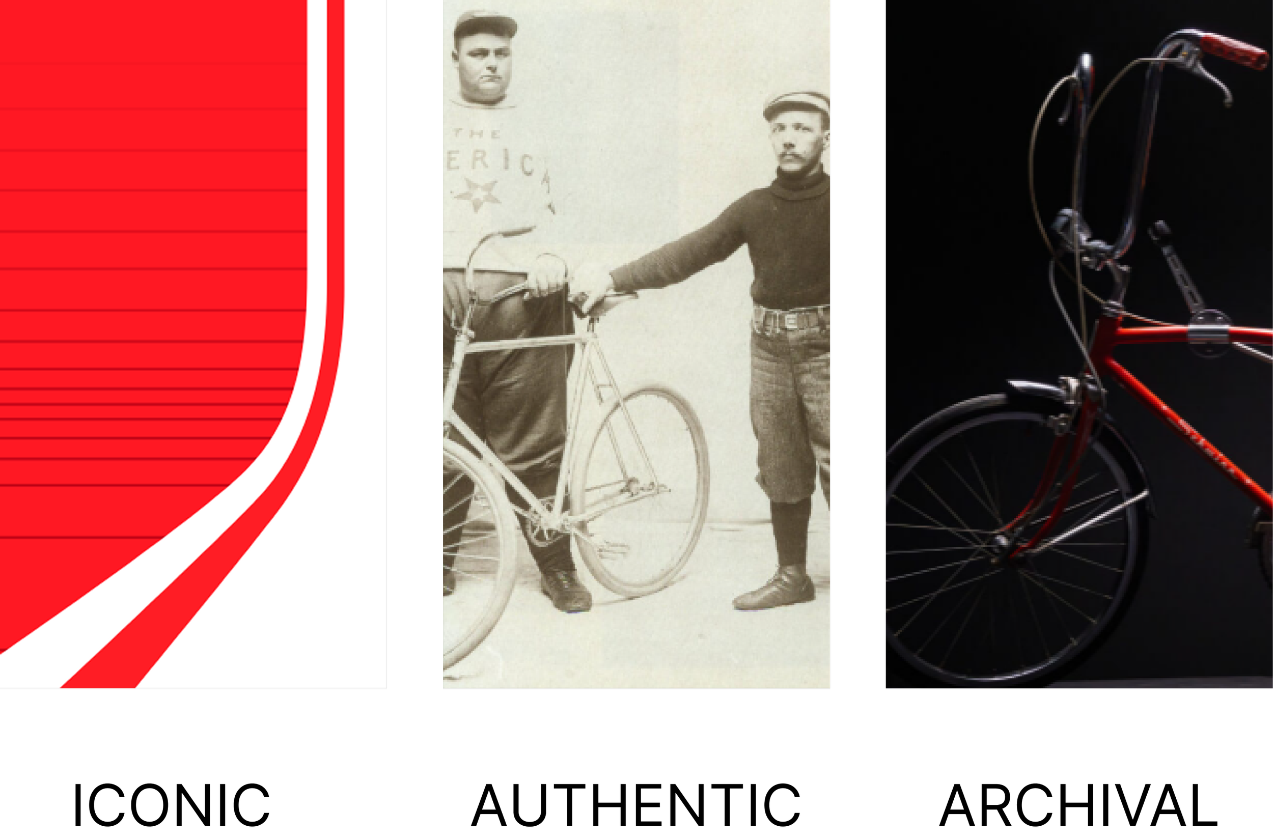
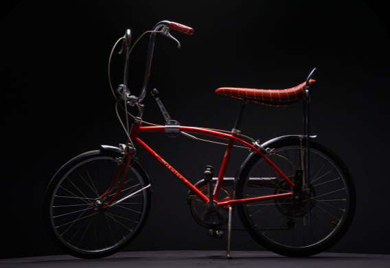
A bold, documentary-inspired visual language built from scratch to feel timeless, authentic, and unmistakably Schwinn.
COLOR PALETTE

TYPOGRAPHY

VISUAL LANGUAGE
TONE
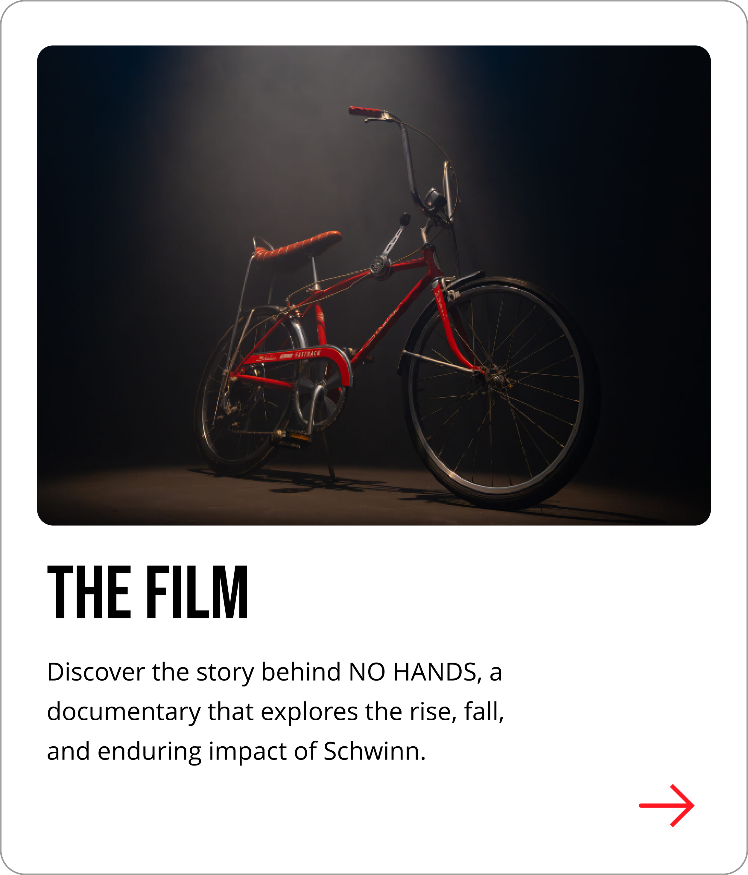
Website experience
Outcome
The NO HANDS website gives the documentary a bold digital presence before release. It brings the Schwinn story to life through cinematic visuals, archival content, interactive history, and clear ways for fans to explore, connect, and share their memories.
A journey designed to encourage interest and leads to purchase.
CONVERSION-READY
Organizes a deep archival story into easy to explore chapters.

RICH STORYTELLING
Invites the community to share memories and be part of the story.

FAN ENGAGEMENT
Establishes a distinctive memorable digital presence for the brand and film.

ICONIC PRESENCE

LIVE SITE: THESCHWINNDOCUMENTARY.COM